Gambyt
Modernizing how players create and manage playslips
ROLE
Lead UX Designer
3 Months
Details
Project
Native Mobile
TOOLS
Sketch
OVERVIEW
At Gambyt, I designed a new mobile playslip experience that reimagined how lottery players create and manage their tickets. The goal was to replace outdated paper slips with a faster, more accurate, and environmentally friendly digital solution that streamlined transactions for both players and retail agents.
THE CHALLENGE
How might we modernize an outdated, error-prone paper playslip system?
Traditionally, lottery players fill out paper playslips by hand, marking numbers, bets, and draws before handing them to retail agents who process them manually. This outdated system created inefficiencies on all sides:
Long training time and manual errors at retail terminals
Slow transaction times leading to frustrated players
High costs from printing, shipping, and distributing paper slips
No user-specific tracking or data for players or operators
Limited space on paper slips restricting available bet types
The experience was outdated, fragmented, and unsustainable — ripe for modernization.
COMPETITIVE ANALYSIS
Mapping the strengths and weaknesses of existing playslip experiences
I began by examining how other lotteries had implemented mobile playslips, identifying common strengths and weaknesses:
Accessible: users could create playslips without needing an account
Convenient: some offered saving or favoriting playslips for reuse
Confusing navigation: creation and storage locations were scattered
Limited functionality: QR codes often worked for only one type of game
USER STORY
Defining the baseline mobile experience
Together with the product manager, we mapped key user stories that defined the baseline mobile experience. Players needed to easily: Create, edit, and delete playslips
Create, edit, and delete playslips.
Save or favorite playslips for future use
Quickly preview and confirm selections
These stories informed the information architecture and helped ensure that every interaction, from creating to scanning, felt intuitive and efficient.
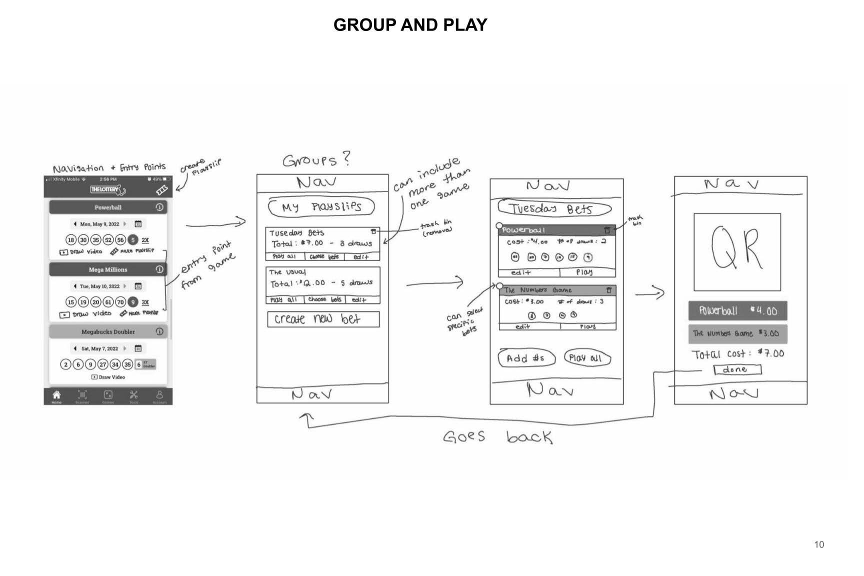
BRAINSTORM WORKSHOP
Leveraging cross-functional input to shape early product decisions
After identifying our goals and user needs, I facilitated an internal design jam with both designers and non-designers to spark fresh perspectives. Each participant sketched their interpretation of the ideal mobile playslip flow, followed by a group critique to evaluate feasibility and clarity. The workshop surfaced valuable ideas and questions, such as:
How would QR scanning perform on lower-end devices?
What’s the simplest way to centralize navigation for creating and saving playslips?
This session not only inspired diverse thinking but also built alignment across teams early on.
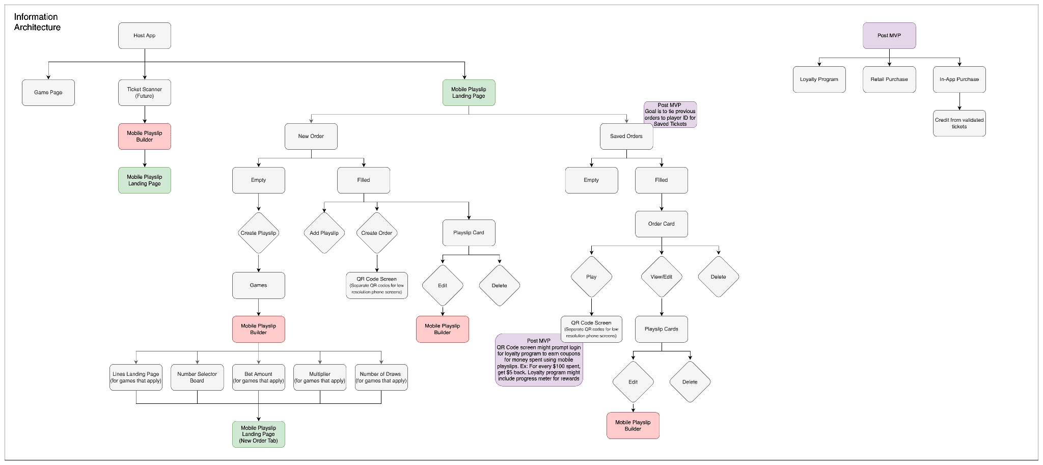
INFORMATION ARCHITECTURE
Translating user needs into a scalable product framework
Next, I developed the information architecture diagram to define how playslips, saved slips, and game types would connect across the product. This step clarified the structural relationships and guided both wireframing and development alignment.
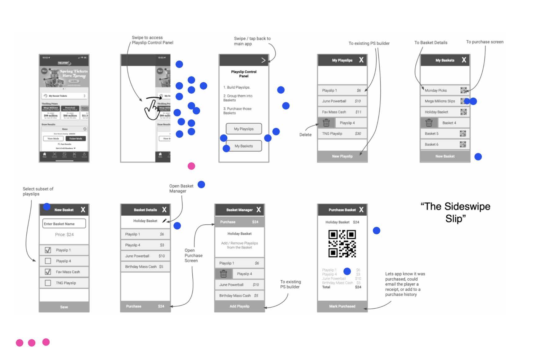
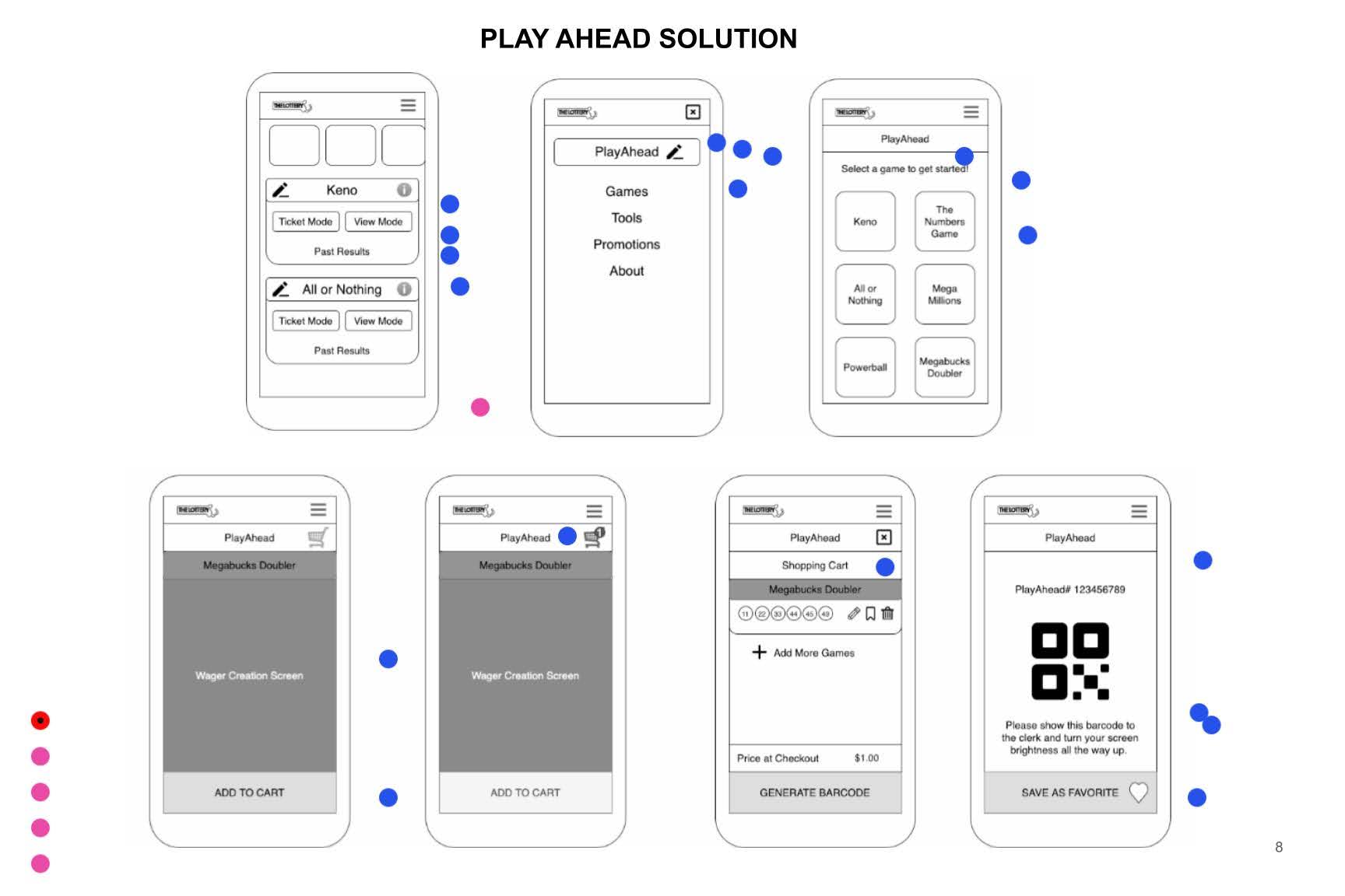
ITERATIVE WIREFRAMING
Turning structure into early visual concepts
Once the IA was solidified, I moved into wireframing, focusing on the key flows for creating, saving, and scanning playslips. These early wireframes helped us quickly test navigation patterns without visual distractions.
We held weekly design reviews with the product manager and mobile team to gather technical and usability feedback. Through multiple iterations, the designs evolved from rough wireframes to refined, high-fidelity mockups.
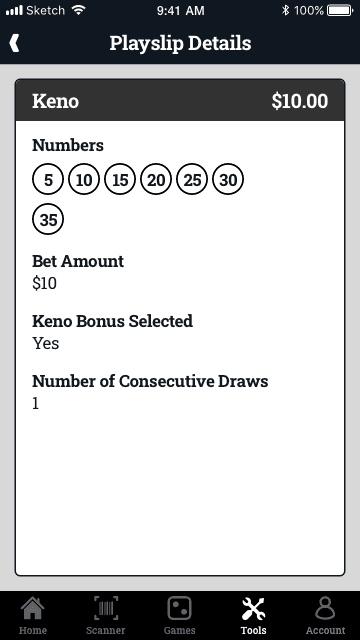
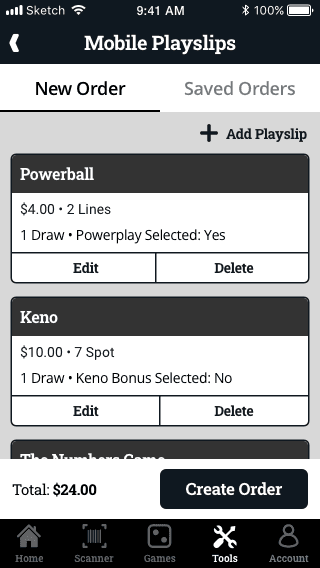
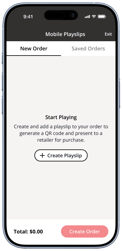
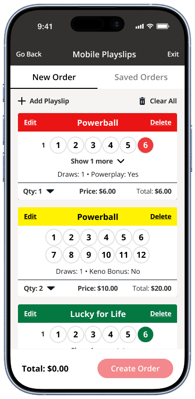
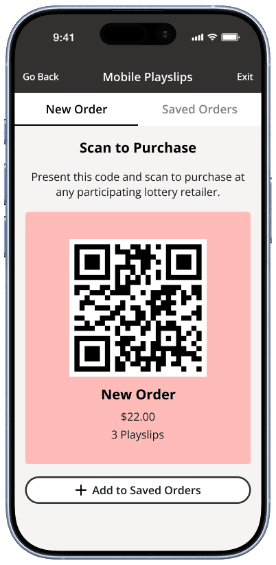
HIGH FIDELITY MOCK-UPS
Translating refined concepts into a cohesive UI
The final design introduced a centralized tab bar where all mobile playslip actions lived — simplifying access and removing the confusion that plagued existing solutions.
Players could now:
Seamlessly create and save playslips in one place
Scan QR codes quickly for different games
Navigate without jumping between scattered screens
This design streamlined transactions, reduced friction, and made the overall experience feel modern and effortless.
